Objective:
Phoenix Energy aimed to create a compelling brand identity and packaging design for an energy drink targeting young adults, e-sports enthusiasts, combat sports athletes, and thrill-seekers. The goal was to resonate with an adventurous and active audience by embodying the spirit of the mythical phoenix, symbolizing rebirth, renewal, and transformation.
Phoenix Energy aimed to create a compelling brand identity and packaging design for an energy drink targeting young adults, e-sports enthusiasts, combat sports athletes, and thrill-seekers. The goal was to resonate with an adventurous and active audience by embodying the spirit of the mythical phoenix, symbolizing rebirth, renewal, and transformation.
Problem:
The challenge was to design a brand identity and packaging that stood out in a competitive market. It needed to capture the energy and power associated with the phoenix while appealing to a diverse and dynamic target audience. The design had to convey the brand's key messages of high-quality natural ingredients and bold, eye-catching branding.
The challenge was to design a brand identity and packaging that stood out in a competitive market. It needed to capture the energy and power associated with the phoenix while appealing to a diverse and dynamic target audience. The design had to convey the brand's key messages of high-quality natural ingredients and bold, eye-catching branding.
Solution:
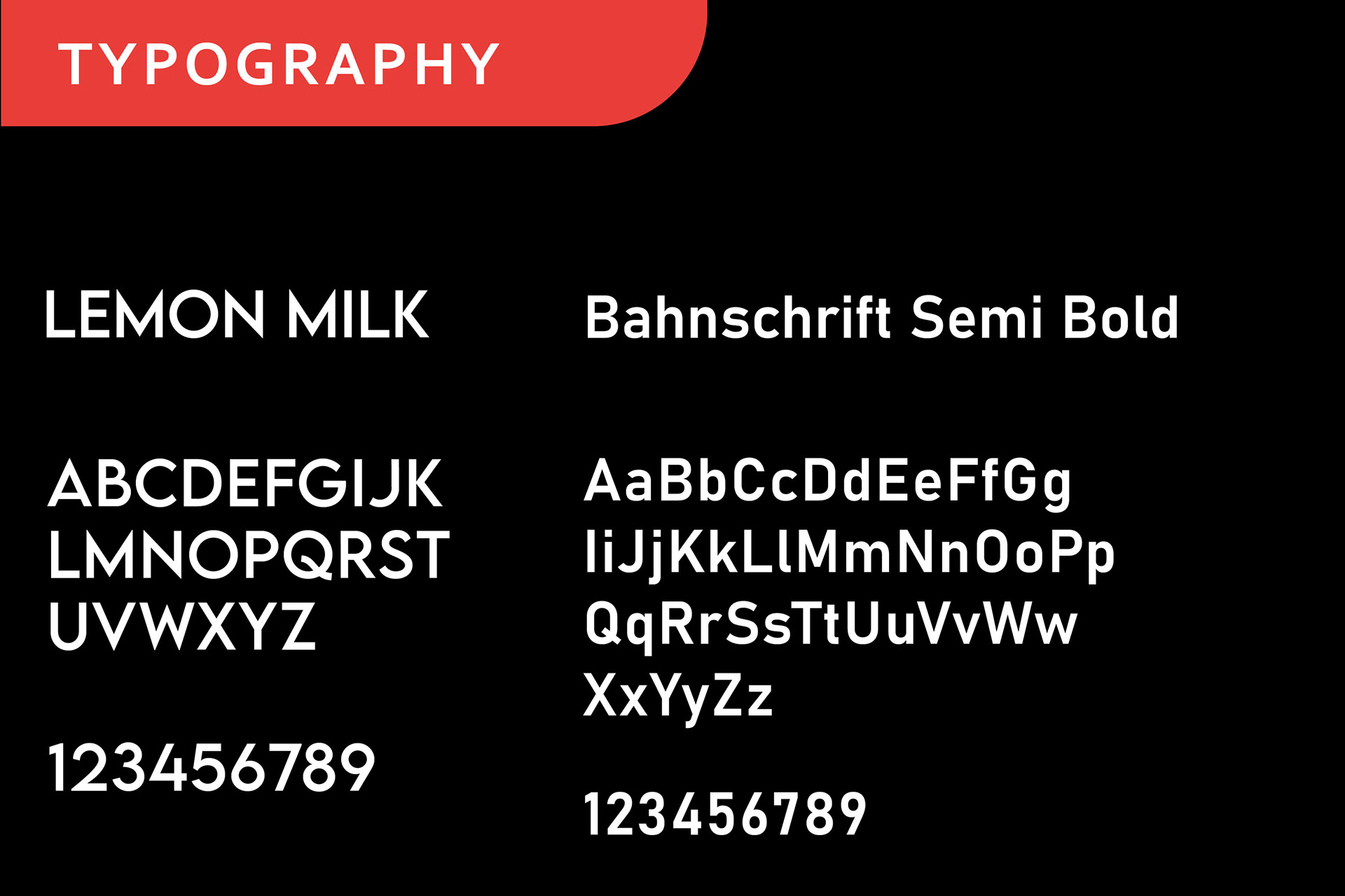
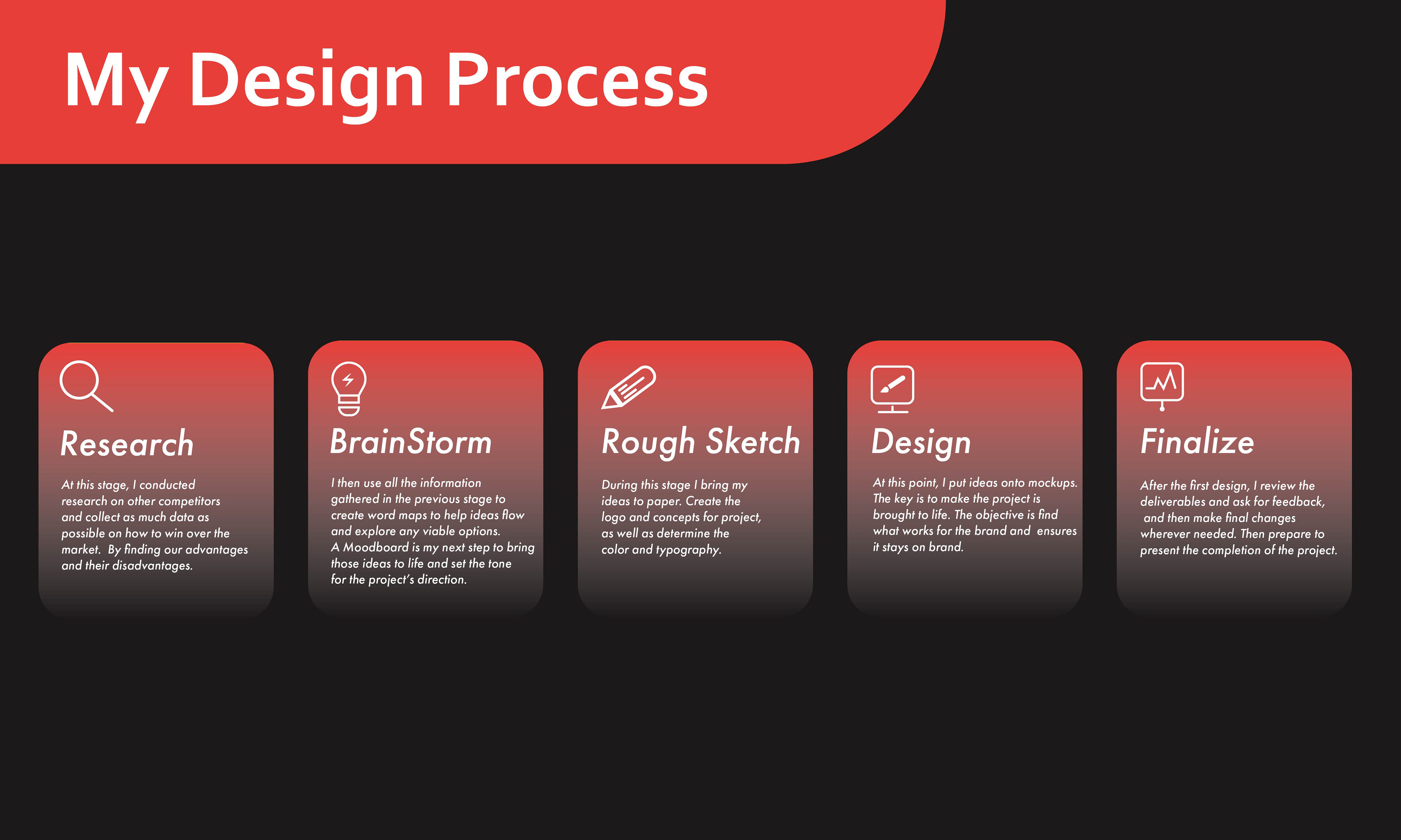
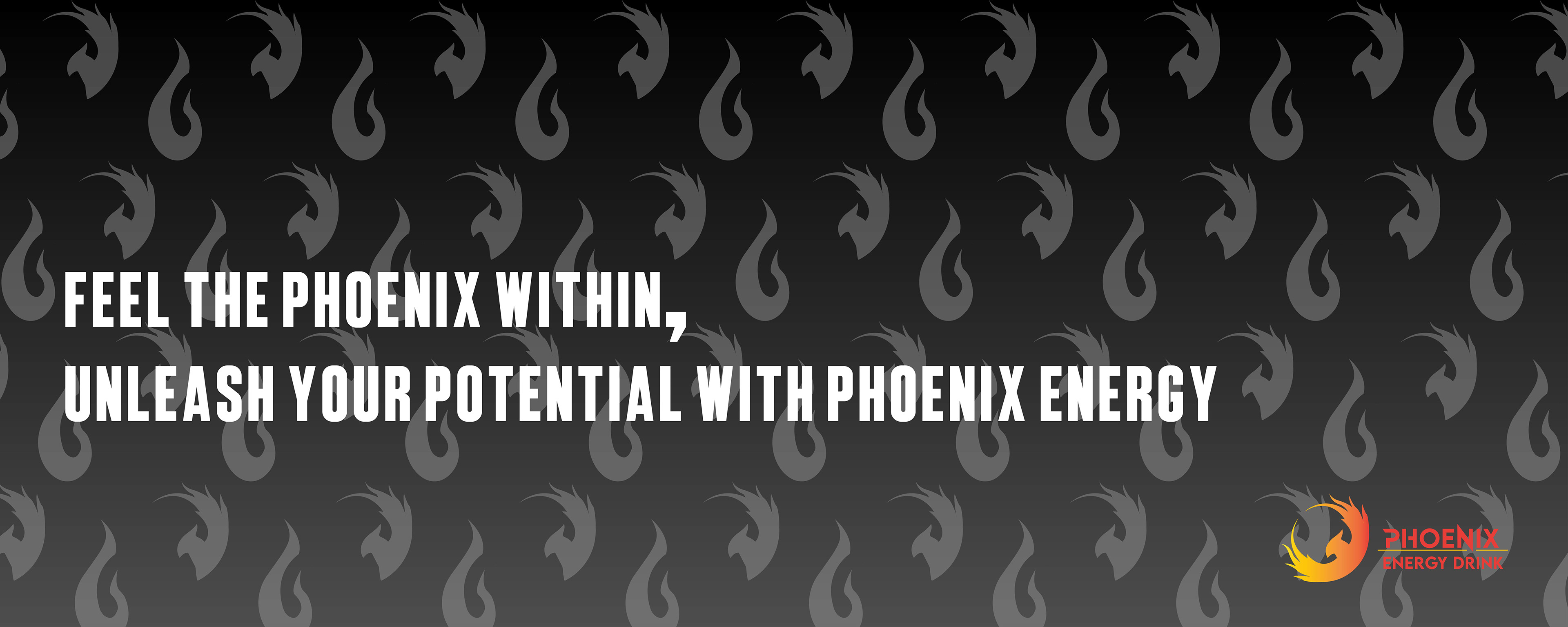
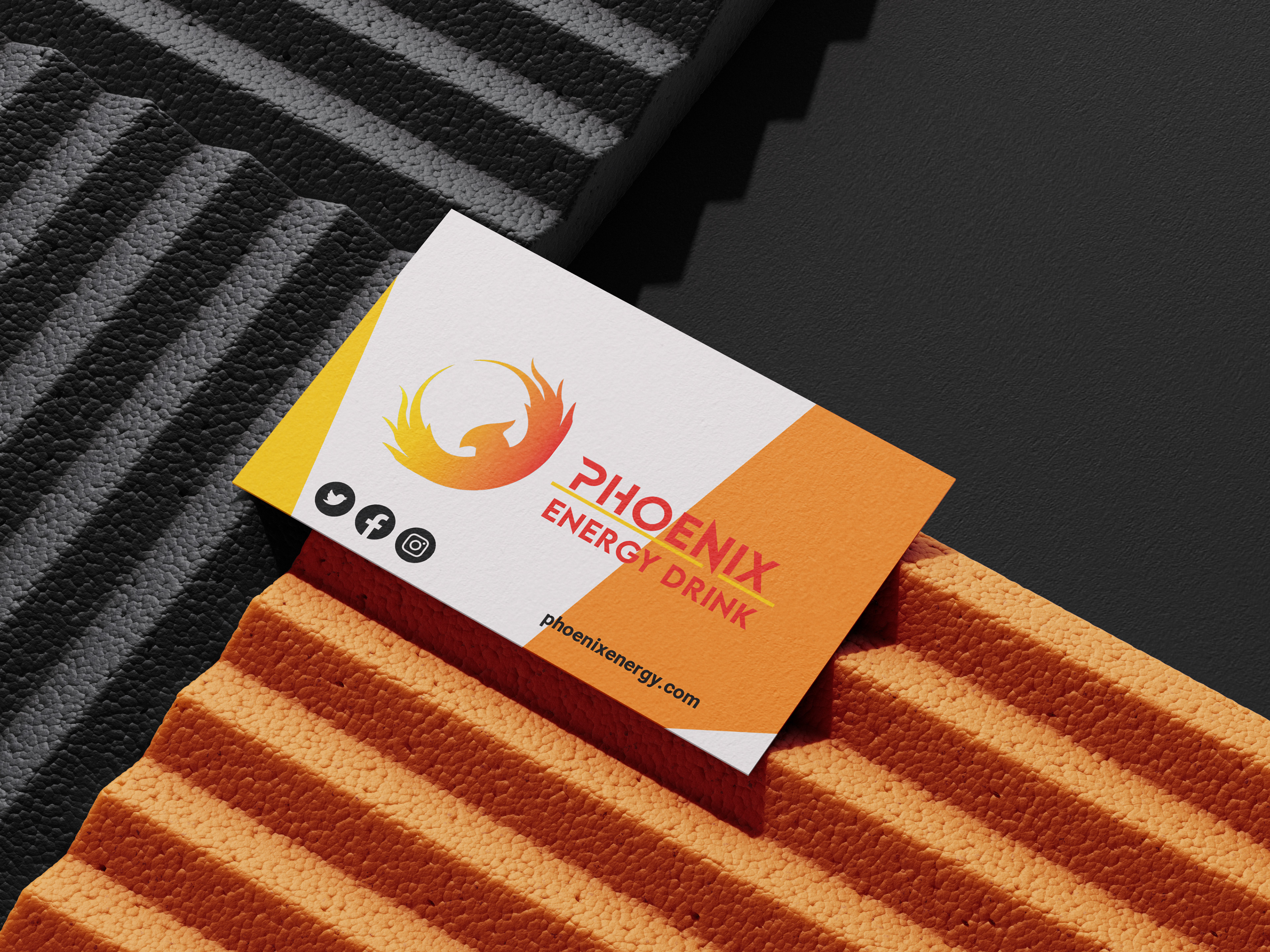
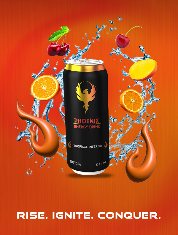
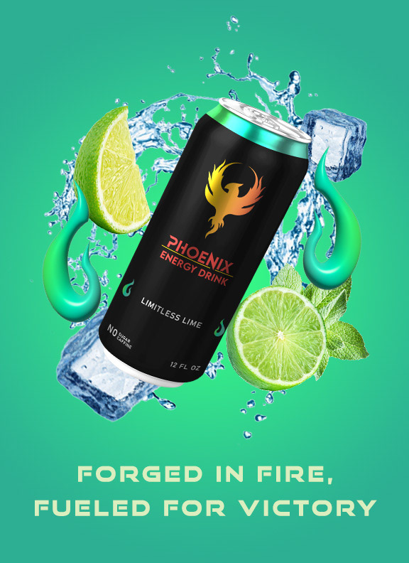
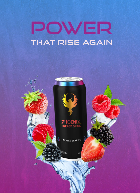
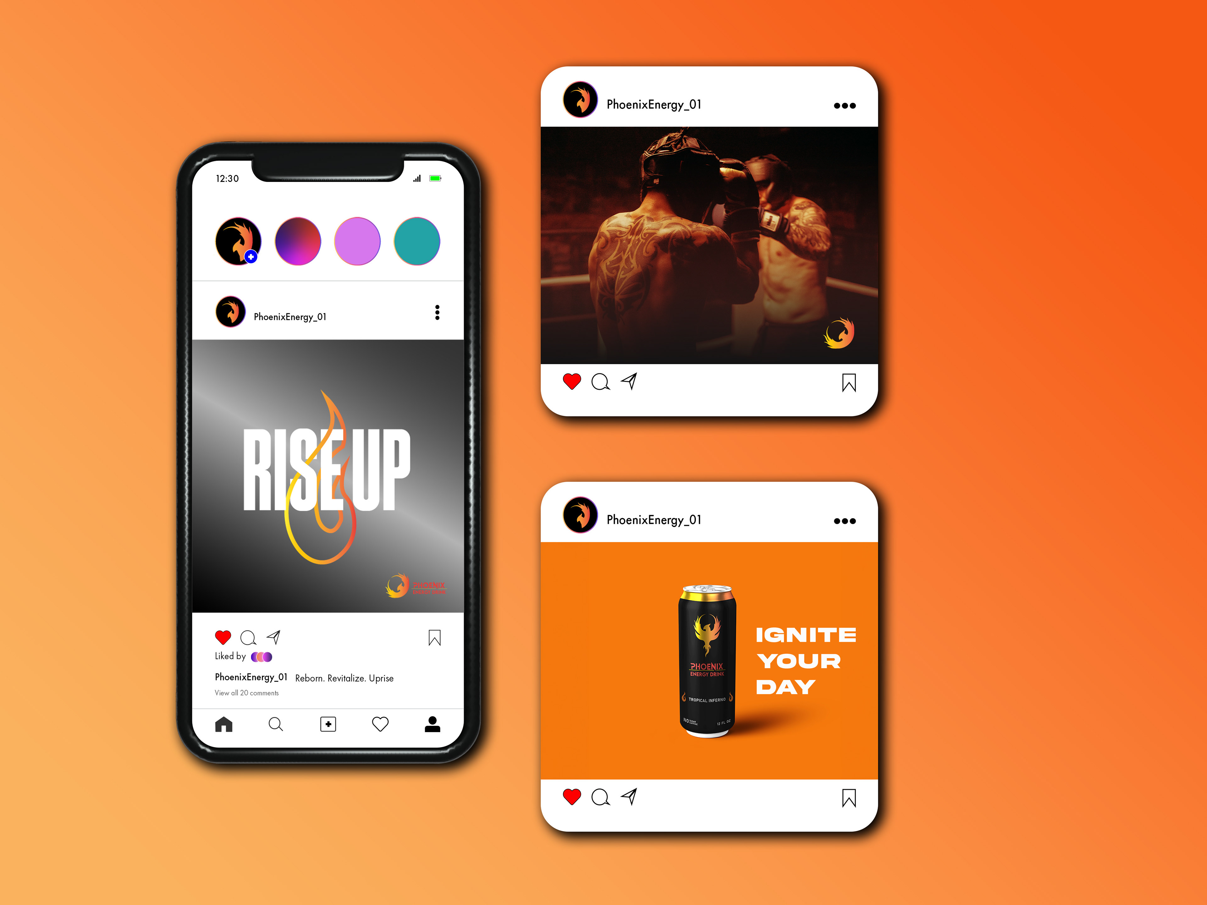
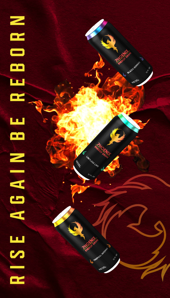
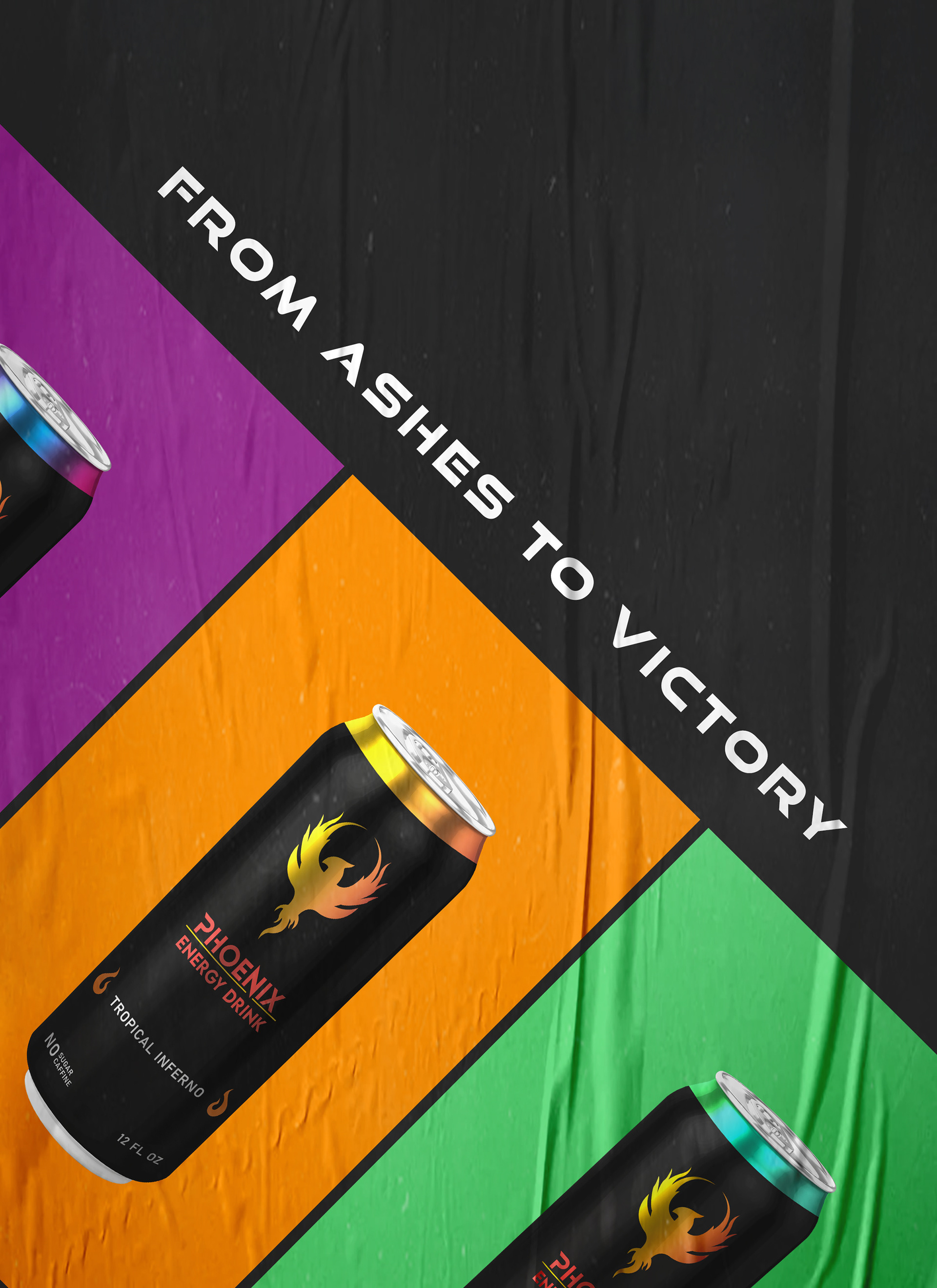
The design process involved experimenting with various elements to create a cohesive and impactful final deliverable. The brand identity was centered around the mythical phoenix, representing energy, power, and endurance. The logo was designed to be bold and modern, using vibrant colors that reflect the dynamic nature of the phoenix. The packaging design featured striking images of the phoenix in dynamic poses, combined with abstract representations of fire, making it visually appealing and memorable. The key messages were integrated into the branding and marketing strategy, emphasizing the brand's inspiration from the phoenix and the use of high-quality natural ingredients.
The design process involved experimenting with various elements to create a cohesive and impactful final deliverable. The brand identity was centered around the mythical phoenix, representing energy, power, and endurance. The logo was designed to be bold and modern, using vibrant colors that reflect the dynamic nature of the phoenix. The packaging design featured striking images of the phoenix in dynamic poses, combined with abstract representations of fire, making it visually appealing and memorable. The key messages were integrated into the branding and marketing strategy, emphasizing the brand's inspiration from the phoenix and the use of high-quality natural ingredients.
The branding and packaging design for Phoenix Energy successfully captured the essence of the phoenix, creating a strong and memorable brand identity. The bold and vibrant design resonated with the target audience, appealing to their adventurous and active lifestyle. The emphasis on high-quality natural ingredients further strengthened the brand's appeal, setting it apart from competitors.


My Thought Process
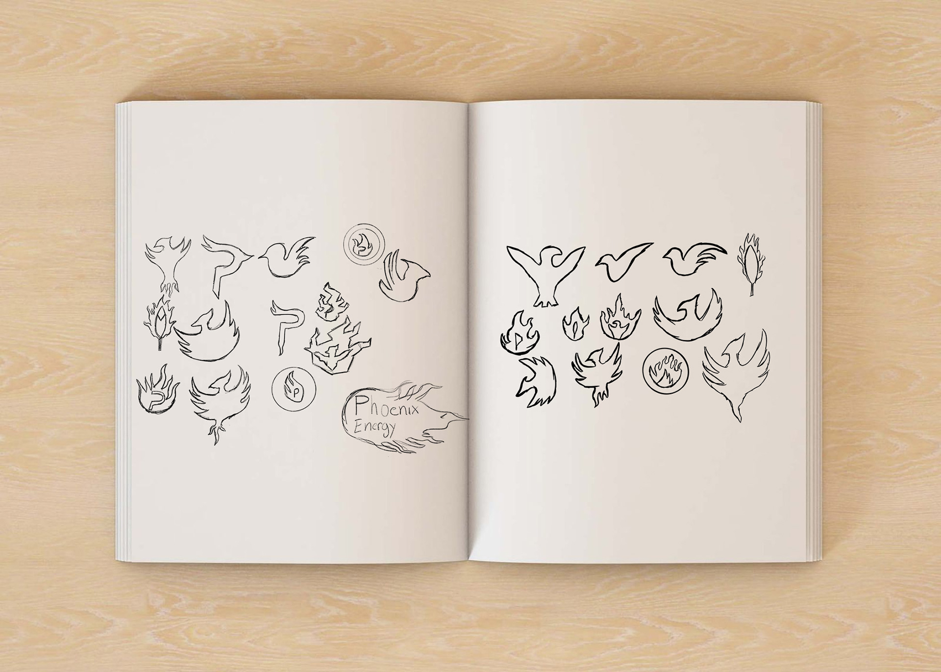
I designed the Phoenix logo to convey a sense of energy, power, and endurance, which are essential for success in the target industries. The lifted wing pose of the phoenix represents movement, flight, and freedom, while the fire gradient symbolizes passion, intensity, and energy. The bold and modern typography of the brand name complements the logo, creating a cohesive and memorable brand identity. The result is an excellent phoenix design that embodies the qualities of transformation, rebirth, energy, and passion, creating a unique and memorable brand identity that resonates with the target audience. The design process demonstrates the importance of understanding the brand's identity and target audience and how the correct design elements can create a cohesive and powerful brand identity.
The Challenge
The energy drink market is crowded, with many brands using aggressive, neon-heavy designs to appeal to young, active consumers. Phoenix Energy needed a distinctive brand reflecting strength, renewal, and vitality while standing out on shelves and resonating with an audience of e-sports enthusiasts, athletes, and thrill-seekers.
Key challenges:
Differentiation: Standing out in a market dominated by loud, high-contrast designs.
Appeal to Active Lifestyles: Ensuring the brand felt both premium and energizing, aligning with an audience seeking peak performance.


Reflections – A Brand of Resilience & Transformation
The Phoenix Energy brand successfully blends mythical imagery with modern design to create a compelling visual identity that stands out in a competitive space. The design reflects the core values of rebirth and power while appealing to a young, active demographic.
What worked well:
The fiery color palette and dynamic imagery perfectly communicate energy and power.
The phoenix symbol became a memorable brand mark, resonating deeply with the target audience.
What I learned:
Balance between mythology and modern appeal is key to creating a brand that’s both timeless and relevant.
The importance of aligning visual elements with the brand story—a clear narrative can make a brand feel more authentic.
Thank you,
I hope you enjoyed it.