Objective:
Happy Daze aims to create a unique brand and product line that offers young adults a tasty, enjoyable snack infused with high-quality cannabis. The objective is to deliver a snack that satisfies cravings and provides the therapeutic benefits of cannabis, all while aligning with the target audience's laid-back and adventurous lifestyle.
Happy Daze aims to create a unique brand and product line that offers young adults a tasty, enjoyable snack infused with high-quality cannabis. The objective is to deliver a snack that satisfies cravings and provides the therapeutic benefits of cannabis, all while aligning with the target audience's laid-back and adventurous lifestyle.
Problem:
Happy Daze faced the challenge of standing out in a crowded market of cannabis products. The company needed to develop a brand identity and product packaging that resonated with young adults aged 18–35 who are health-conscious, fun-loving, and value natural, high-quality ingredients. Additionally, the brand needed to convey a sense of relaxation and enjoyment while emphasizing the therapeutic benefits of its products.
Happy Daze faced the challenge of standing out in a crowded market of cannabis products. The company needed to develop a brand identity and product packaging that resonated with young adults aged 18–35 who are health-conscious, fun-loving, and value natural, high-quality ingredients. Additionally, the brand needed to convey a sense of relaxation and enjoyment while emphasizing the therapeutic benefits of its products.
Solution:
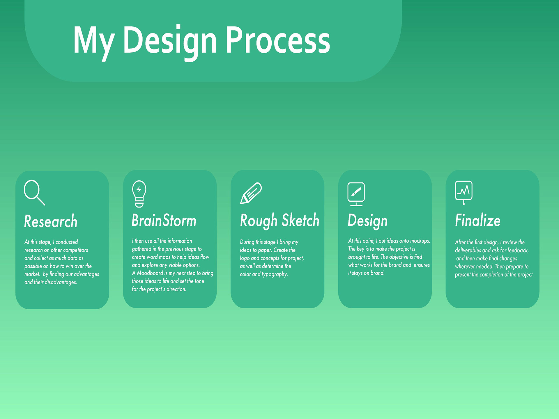
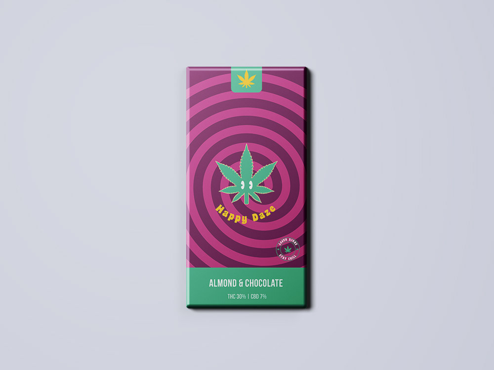
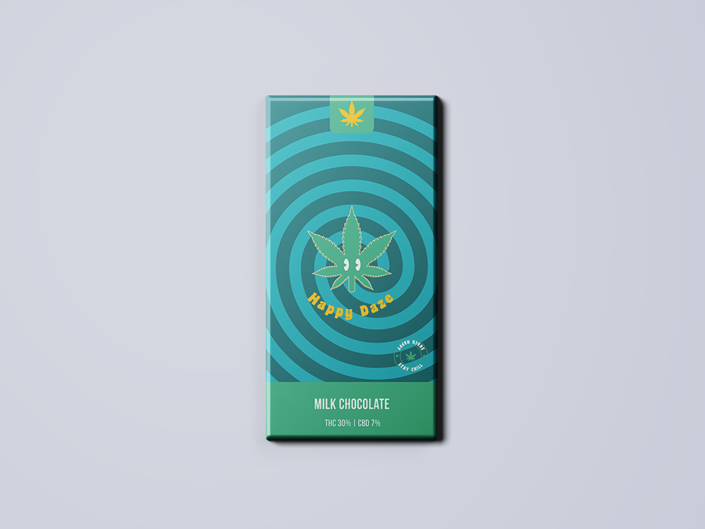
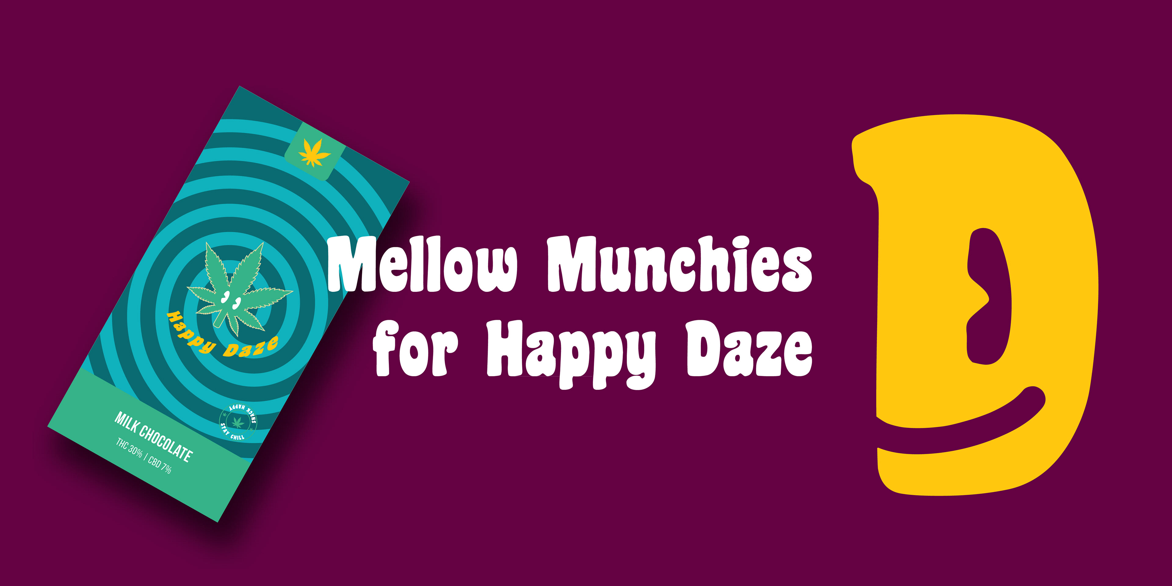
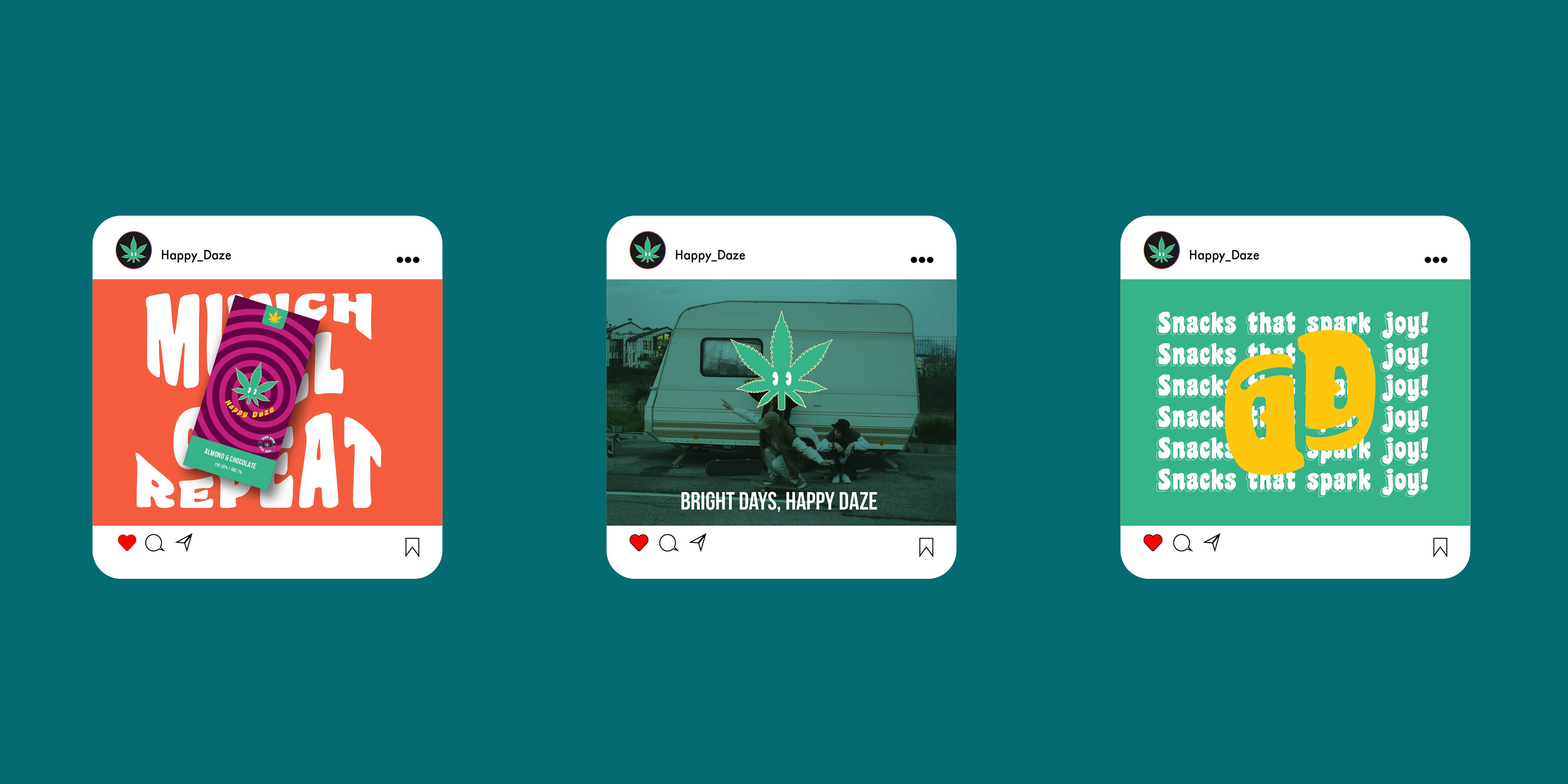
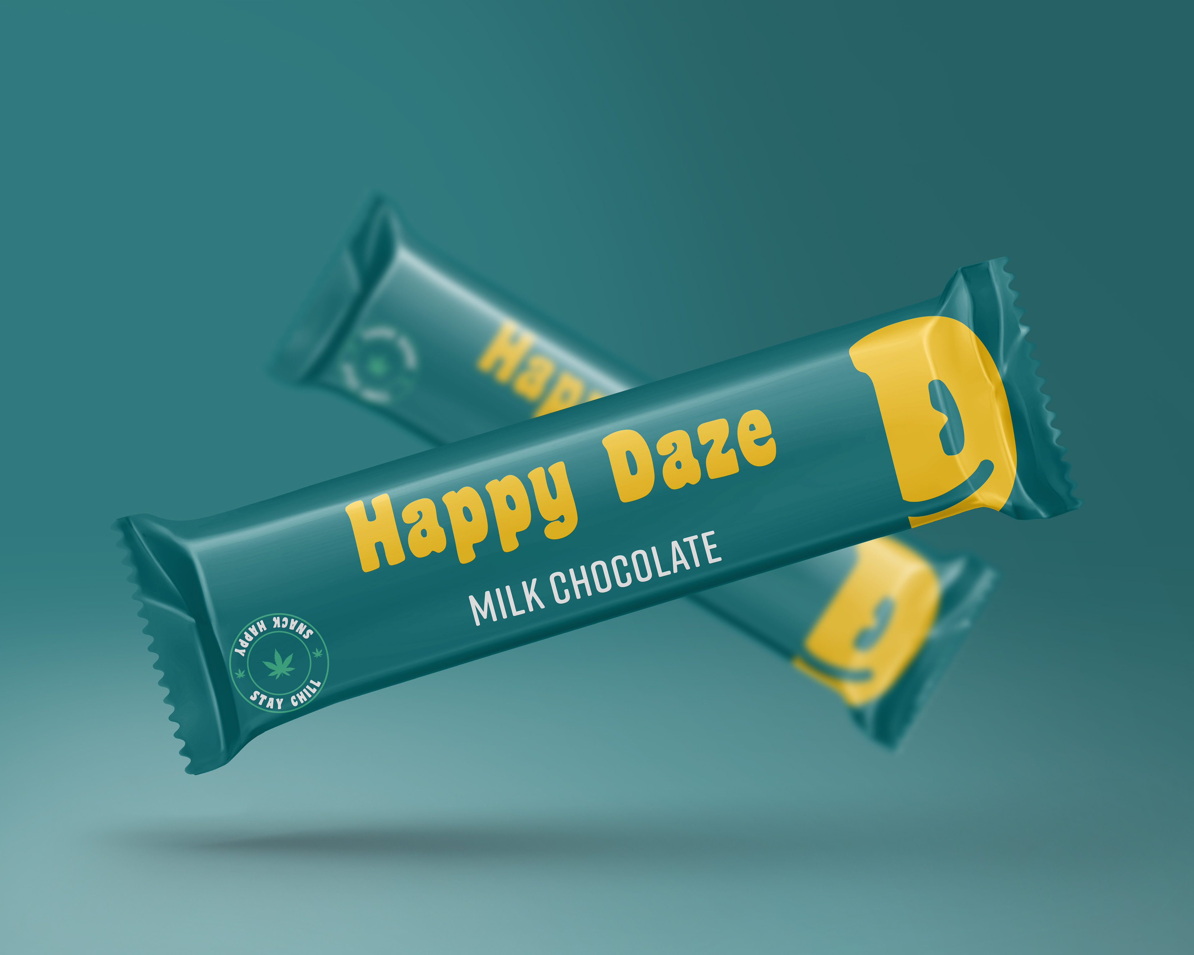
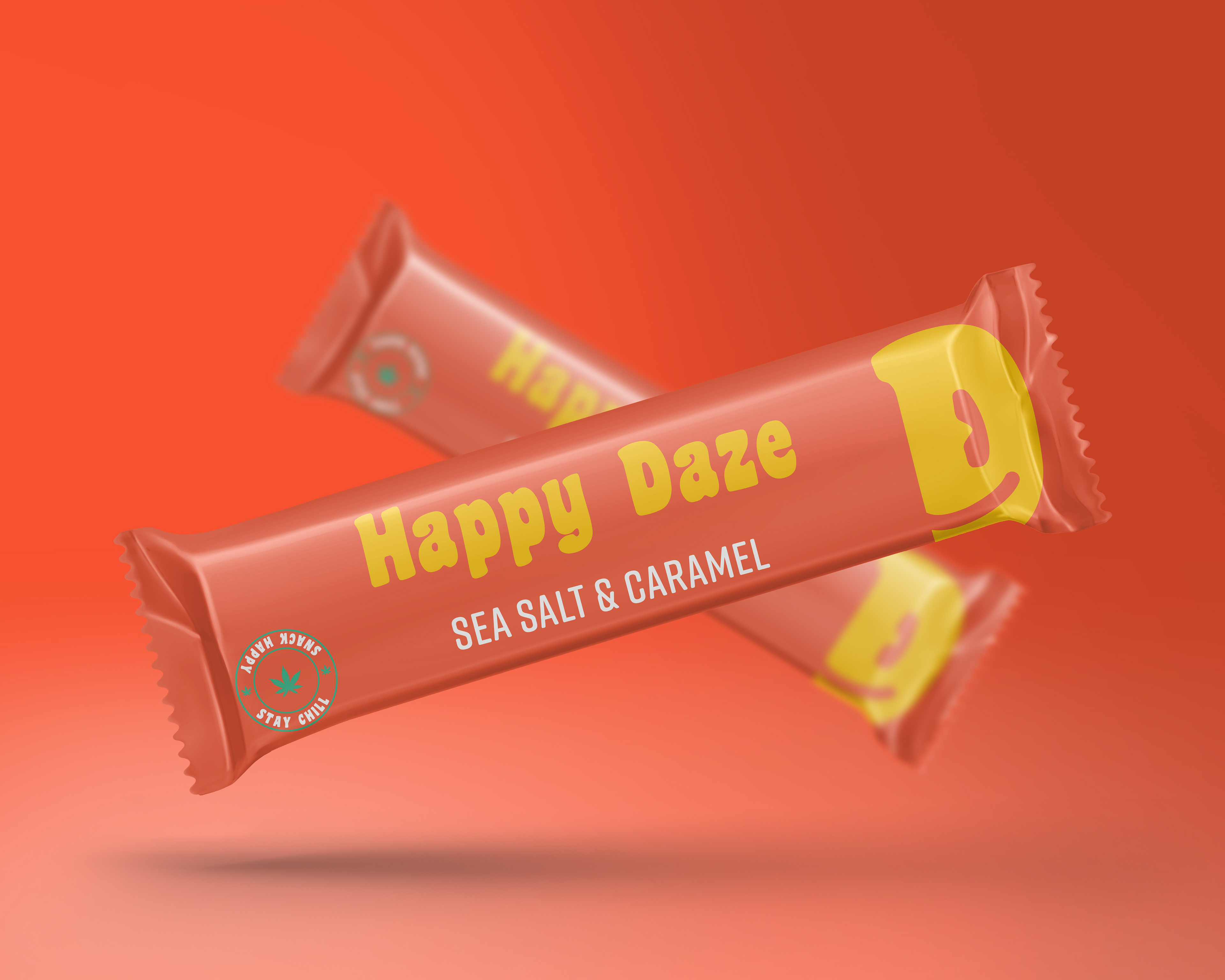
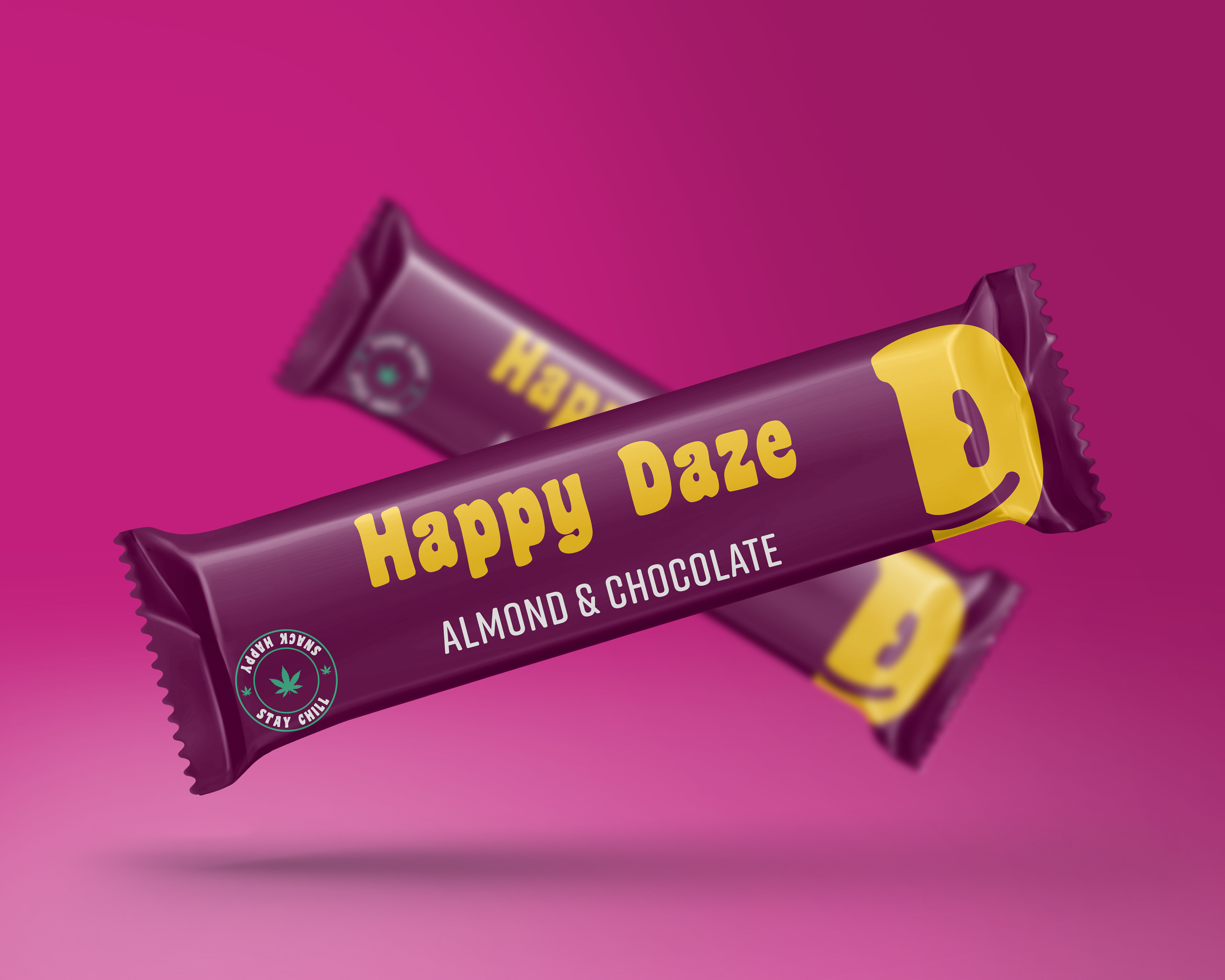
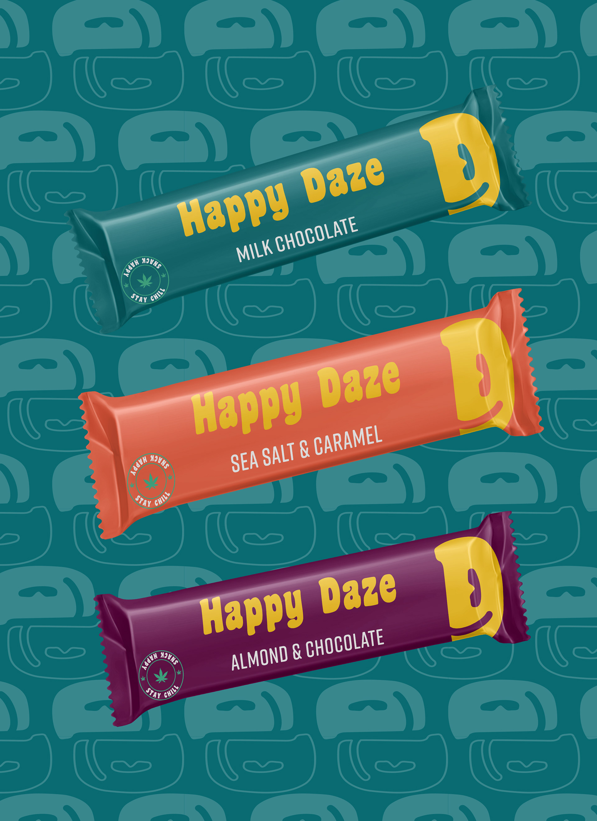
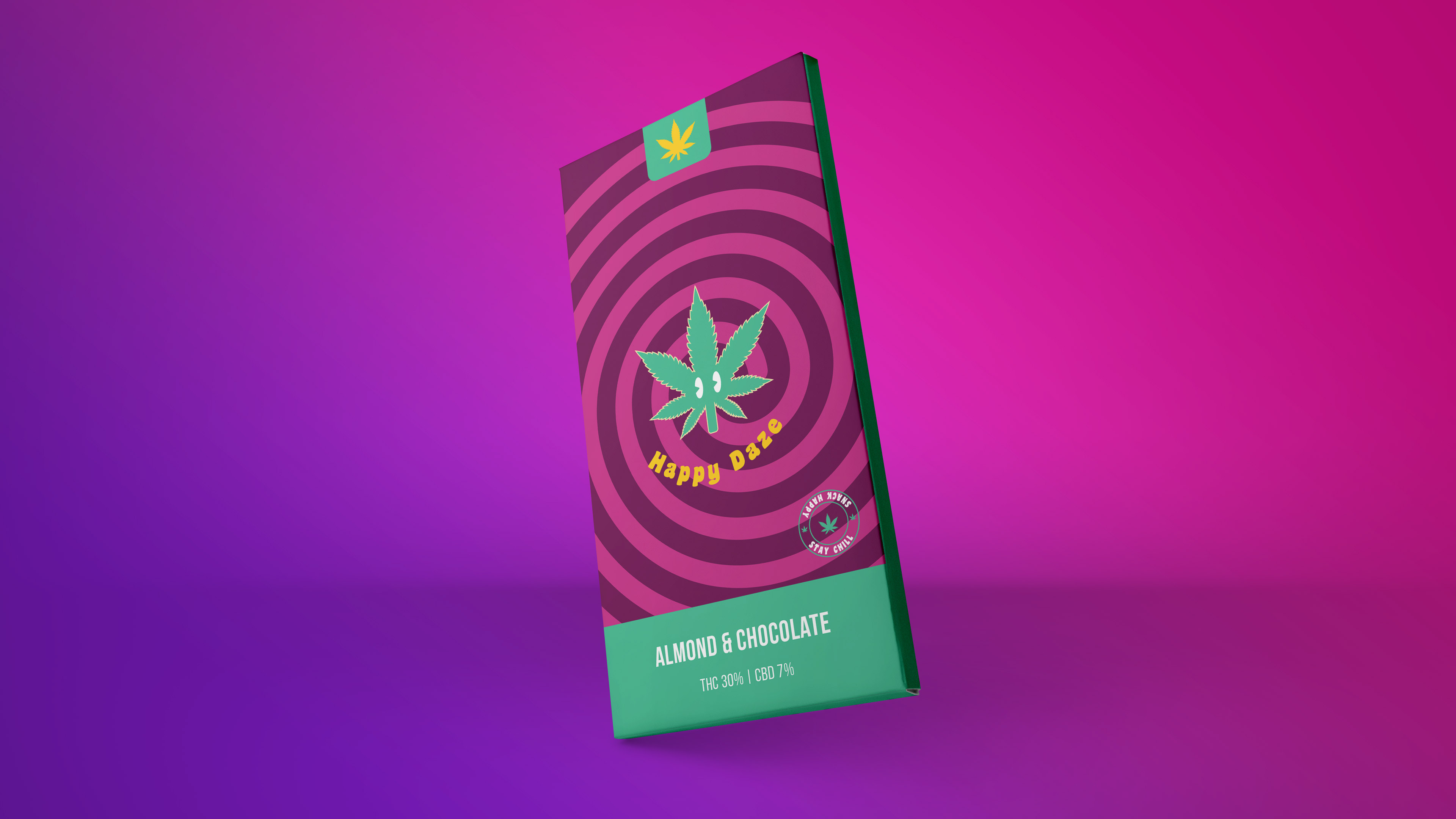
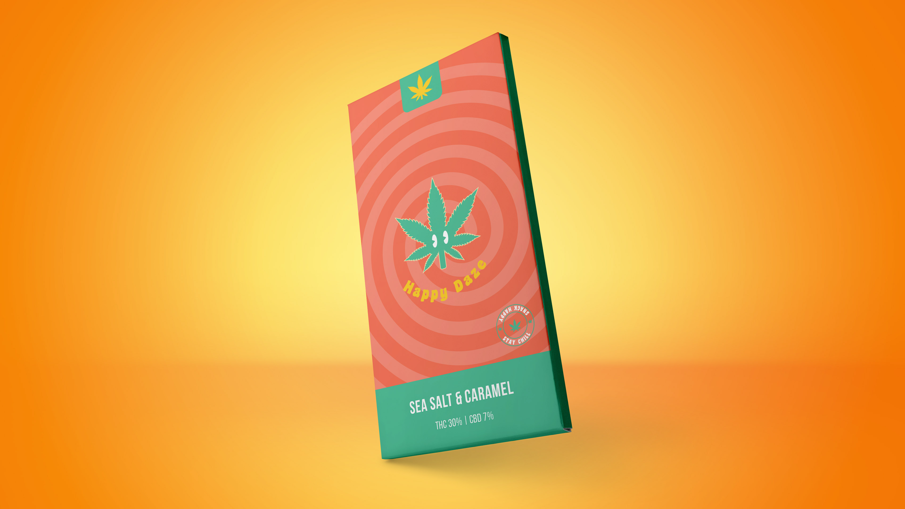
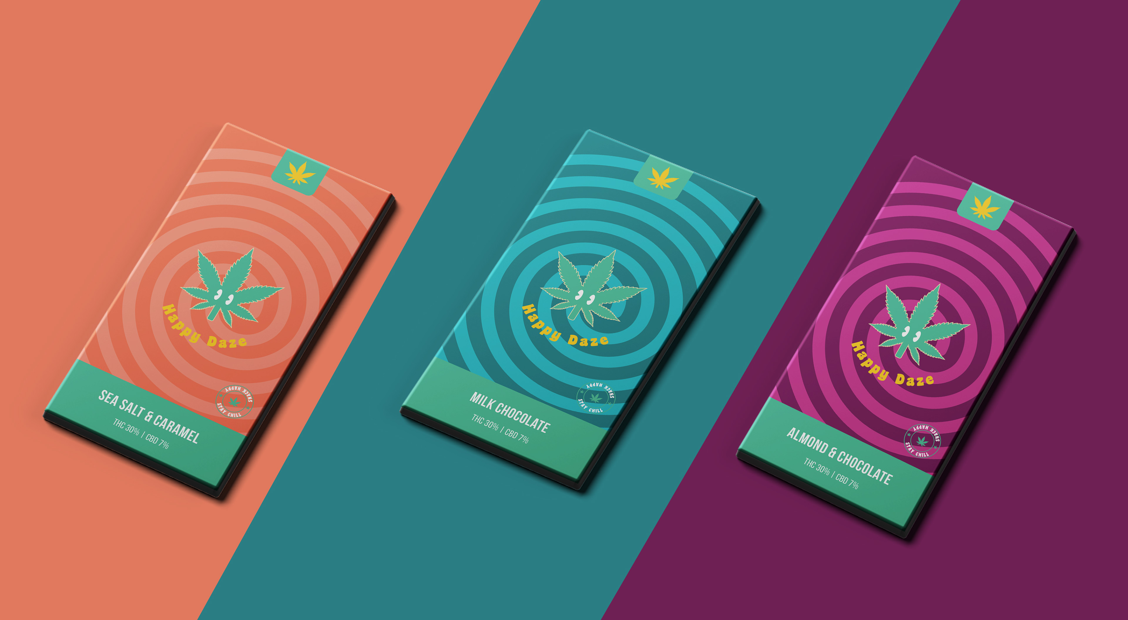
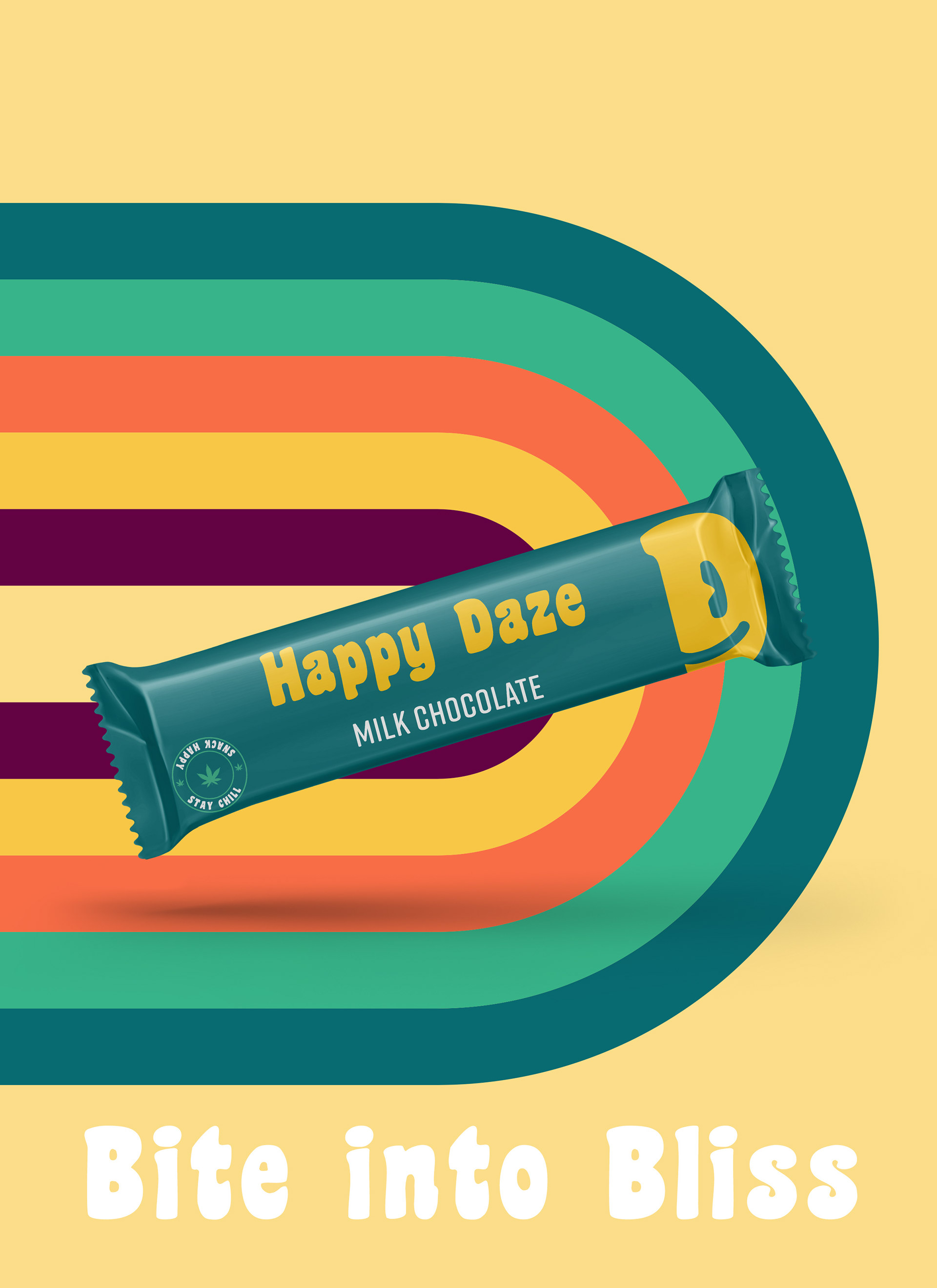
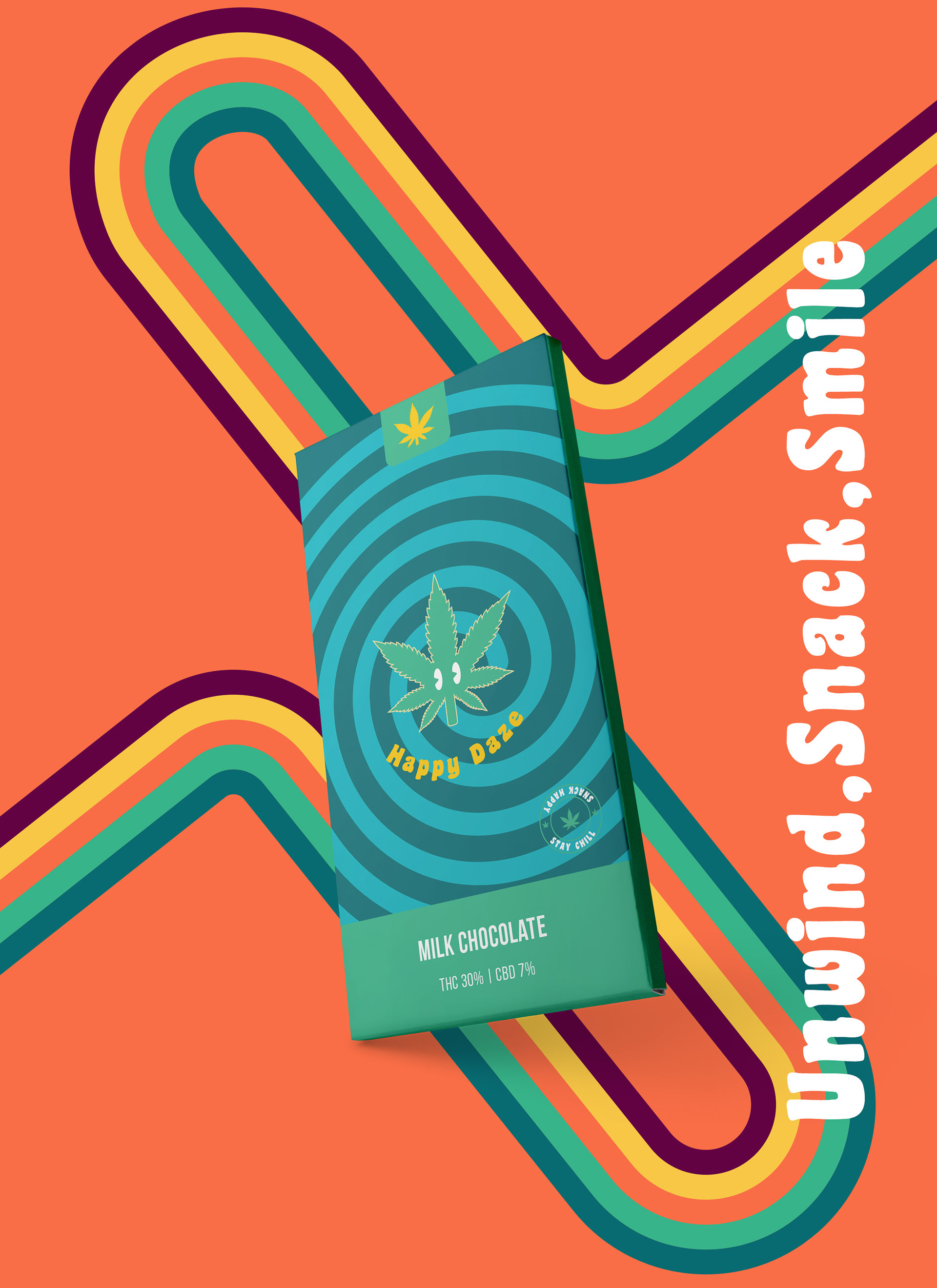
Happy Daze implemented a multifaceted approach to address these challenges. The brand development focused on creating a personality that is fun, adventurous, and laid-back, emphasizing relaxation and enjoyment. An approachable, modern, and friendly brand image with a touch of edginess was cultivated to appeal to the target audience. The product line introduced a range of cannabis-infused snacks made from natural, high-quality ingredients, ensuring they cater to the adventurous and active lifestyle of young adults. The packaging design was crafted to be vibrant and eye-catching, capturing the essence of the Happy Daze brand. Bold colors and playful graphics were used to stand out on the shelves and attract the target audience, while clear information about the therapeutic benefits and high-quality ingredients was included to build trust and transparency with customers.
Happy Daze implemented a multifaceted approach to address these challenges. The brand development focused on creating a personality that is fun, adventurous, and laid-back, emphasizing relaxation and enjoyment. An approachable, modern, and friendly brand image with a touch of edginess was cultivated to appeal to the target audience. The product line introduced a range of cannabis-infused snacks made from natural, high-quality ingredients, ensuring they cater to the adventurous and active lifestyle of young adults. The packaging design was crafted to be vibrant and eye-catching, capturing the essence of the Happy Daze brand. Bold colors and playful graphics were used to stand out on the shelves and attract the target audience, while clear information about the therapeutic benefits and high-quality ingredients was included to build trust and transparency with customers.
The branding and packaging efforts successfully positioned Happy Daze as a unique and appealing choice in the cannabis snack market. The vibrant packaging and fun, laid-back brand personality resonated with young adults, helping to attract new customers and build a loyal following. The emphasis on high-quality ingredients and therapeutic benefits further strengthened the brand's appeal to health-conscious consumers.
My Thought Process
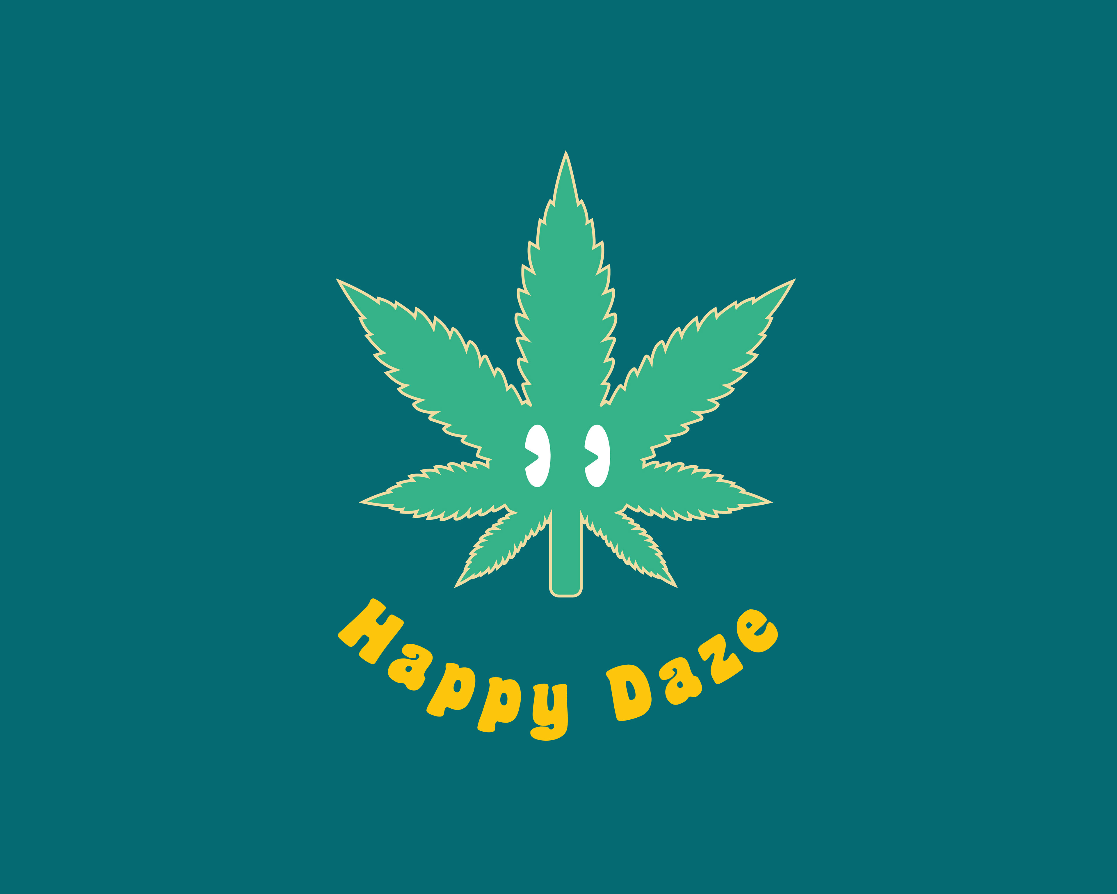
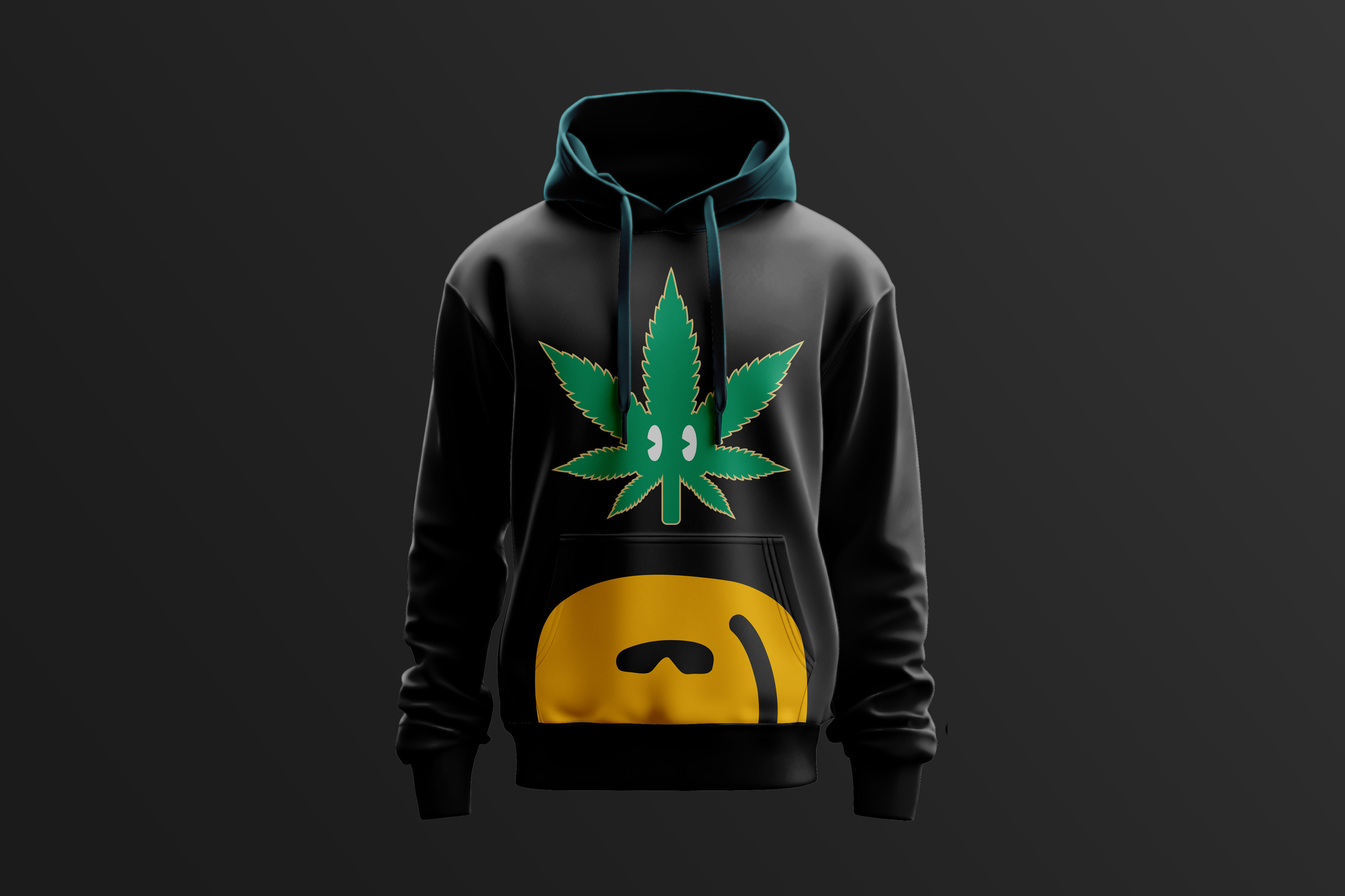
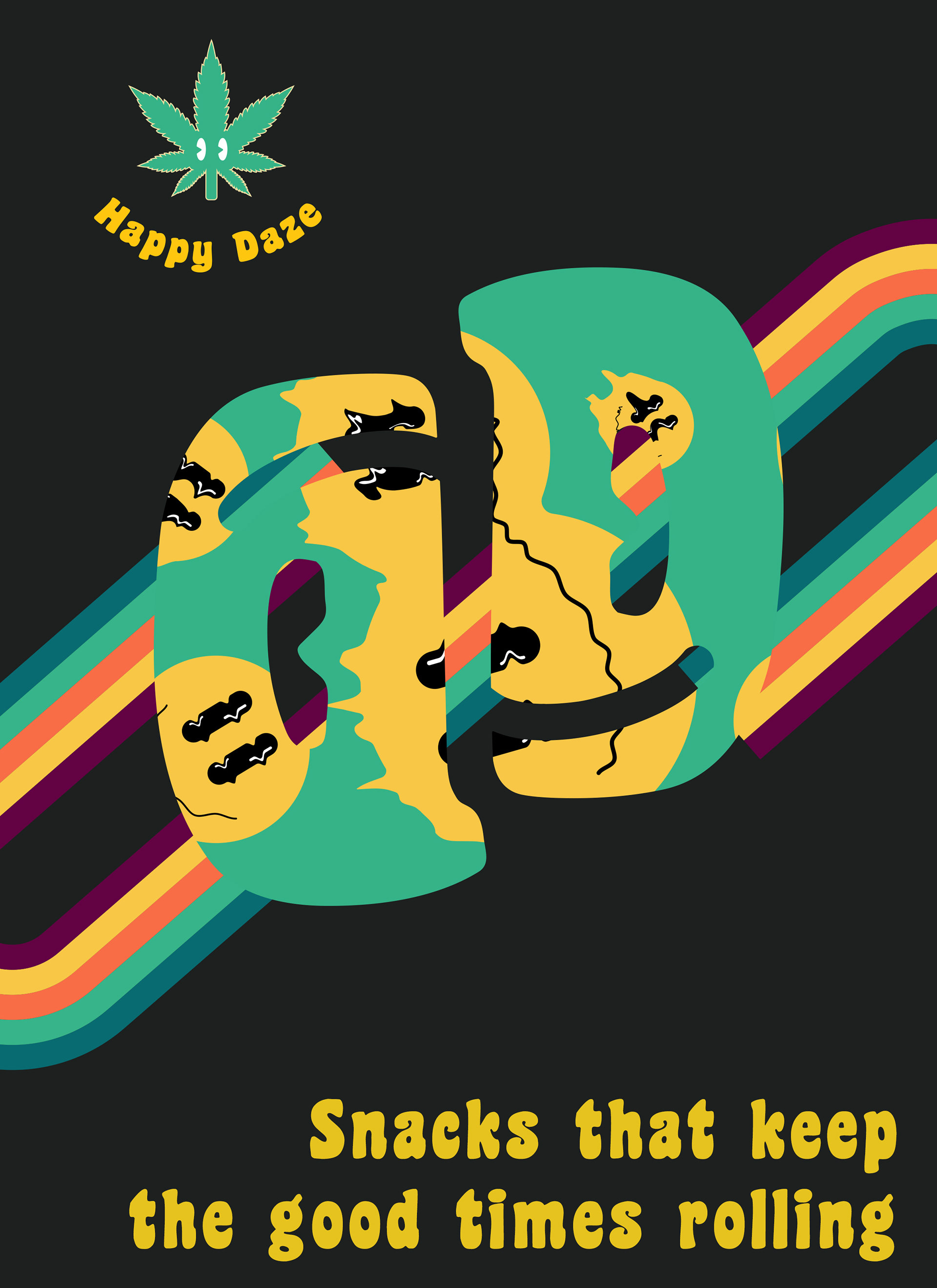
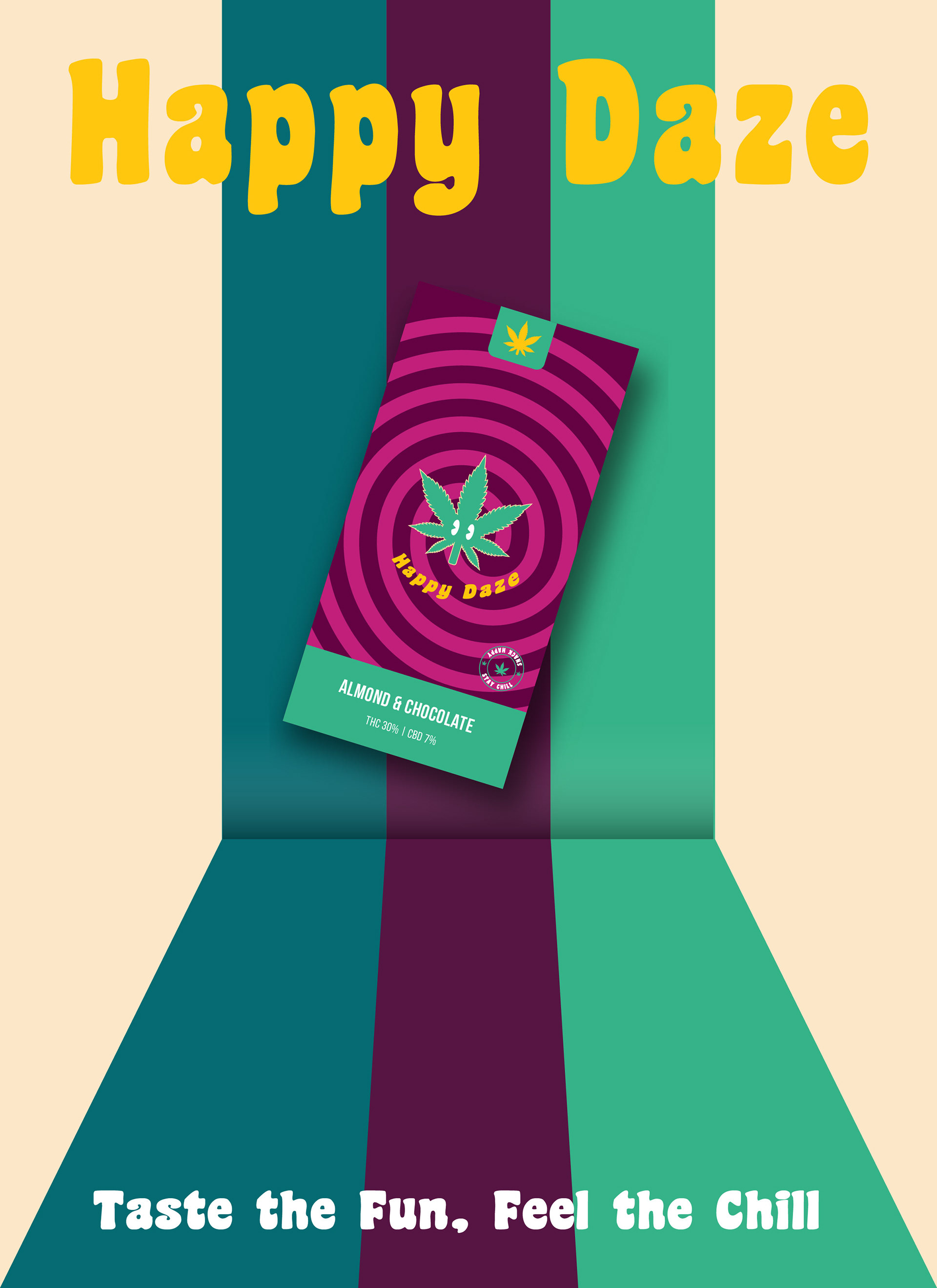
Yellow is often associated with happiness, optimism, and positivity, as it is the color of the sun, smiley faces, and many cheerful objects. Green can also represent balance, harmony, and calmness, enhancing yellow's optimistic and joyful effects. Therefore, green and yellow can create a mood of joy, positivity, and relaxation, appealing to audiences seeking enjoyable and uplifting experiences.
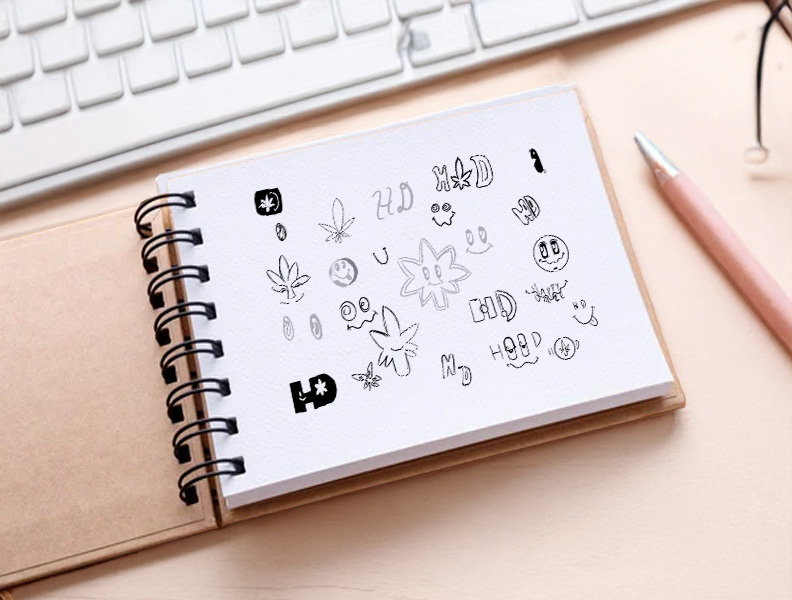
Using a marijuana leaf as a mascot, the brand can signal to the audience that it relates to cannabis culture and products. However, by inverting the typeface into a smile, the brand can also convey a playful and approachable personality, making the audience feel more comfortable and engaged with the brand. The smile can also suggest that the brand's products can make people happy and relaxed, which can be a desirable effect for cannabis-based snacks. By using a friendly and smiling mascot, the brand can avoid the stereotypes of stoner culture and appeal to a broader audience that may be curious or open-minded about cannabis but not necessarily identify as heavy users or enthusiasts. A unique and memorable logo can help the brand stand out from other cannabis snack brands that may use more generic or traditional imagery. By combining the marijuana leaf with the inverted smile, the brand can create a distinctive and recognizable logo easily associated with the brand name and products. The logo can also convey a sense of creativity and innovation, appealing to audiences seeking new and unique experiences.
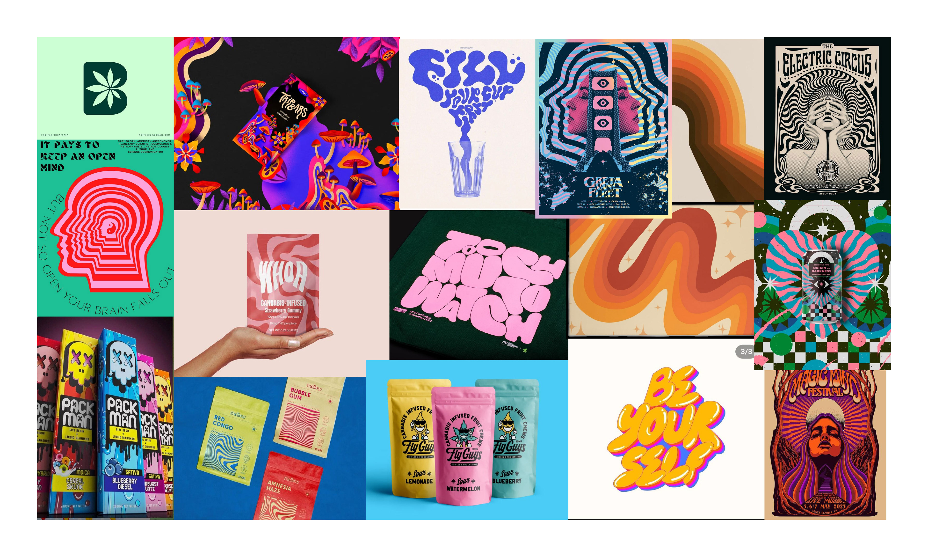
The Challenge – Making Cannabis Snacks Appealing & Fun
As the cannabis industry grows, many cannabis snack brands struggle to find a balance between playful, approachable designs and the serious nature of the product. Happy Daze needed a brand identity that would speak to millennials and Gen Z consumers while standing out in a market with highly saturated, bold designs.
Key challenges:
Tone of Voice: Balancing fun, vibrant branding with the responsible image cannabis products must convey.
Saturated Market: Creating a design that would stand out among the many cannabis snack brands already on the market.
Appealing to the Right Demographic: Ensuring the brand feels welcoming and lighthearted without being too whimsical.


Reflections – Bringing Fun to the Cannabis Snack Market
Happy Daze achieved its goal of creating a vibrant, approachable cannabis snack brand that appeals to young consumers seeking both relaxation and fun. The design successfully navigates the challenge of maintaining a lighthearted tone while still conveying the premium nature of the product.
What worked well:
The playful typography and bold color choices made the design feel approachable yet still premium.
The brand’s lighthearted tone aligns with the values of young cannabis consumers—fun, relaxed, and adventurous.
What I learned:
The tone of voice in design is critical—fun elements need to be paired with responsibility for products in this space.
Packaging is not just about aesthetics, but about making sure it reflects user experience and safety.
Thank You
I hope you have Happy Daze ahead